Studio journal
ANBO: ecommerce shipped, Kickstarter launched
ANBO set out to prove activewear can feel editorial and emotionally memorable—not another loud gym brand. Here is how that vision showed up in product, materials, and storytelling, and how we helped ship the Shopify experience and a Kickstarter launch that could carry the same ambition end to end.
Made to move beautifully
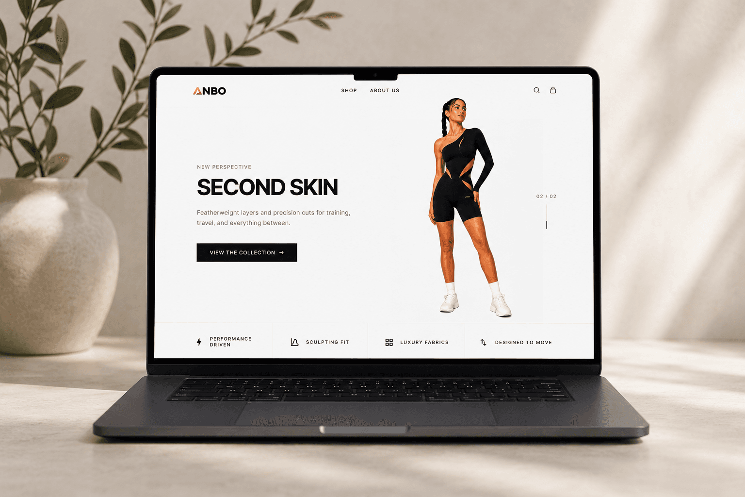
ANBO is performance activewear positioned closer to luxury fashion than to mass-market sportswear: sculptural silhouettes, intentional asymmetry, and a calm visual language where confidence reads through cut and proportion—not through oversized logos or trend-chasing graphics.
The founders describe a turning point: activewear had started to feel interchangeable. Many labels optimized only for utility—stretch, compression, metrics—while others chased fashion at the expense of movement. ANBO exists in the middle: pieces meant to feel premium on the body and in the mirror, still built for real training, travel, studios, and everyday city life.
That positioning set the bar for everything we touched digitally. The site and campaign could not read like a generic template; they had to carry the same emotional clarity as the garments themselves.
The gap in the market
Modern movement is not confined to gyms. People move across fitness, wellness, work, travel, and social contexts in a single week. ANBO’s thesis is that activewear should adapt to that rhythm while still feeling elevated—visually quiet, memorable, and confident rather than disposable or loud.
Another through-line in the brand story is identity: sportswear had long leaned on shapeless, neutral, or aggressively “athletic” aesthetics. ANBO argues that strength and femininity are not opposites—that performance can look beautiful and minimal at once. That idea became the backbone of copy, layout rhythm, and how product photography was framed on the storefront.
Visual identity: quiet by design
Part of ANBO’s critique of the category is visual noise: oversized logos, chaotic patterning, and trend-first graphics that date quickly. The counter-position is a timeless, minimal identity—silhouettes and negative space doing the work so the product stays legible season after season.
That discipline carries straight into digital: restrained UI chrome, typography-led hierarchy, and photography that leads with form instead of promotional clutter. When a brand refuses to shout, every pixel has to earn its place.
Confidence through silhouette
The collection is built around an obsession with the relationship between movement and silhouette: how a line changes perception of the body in motion, how asymmetry creates tension and elegance, and how compression zones are placed with intent rather than as an afterthought.
Every opening, proportion, and seam is described as deliberate—structure and form replace decorative noise. The goal is editorial timelessness: pieces that feel sculpted rather than mass-produced, and that stay legible in a wardrobe for years instead of chasing seasonal hype.
Our job on the digital side was to preserve that discipline. Whitespace, typographic hierarchy, and PDP pacing were treated as seriously as fabric choices—so the interface would feel as intentional as the patterns on the rack.
Product design, materials, and craft
On the product side, ANBO balances technical performance with tactile and visual presence: fabrics chosen for stretch, soft hand-feel, contouring support, durability, breathability, and shape retention—then proven in real movement, not only in stills.
Asymmetry is a signature: cuts that create visual movement without relying on branding noise, aiming for a cleaner premium read that sits closer to contemporary fashion than traditional sportswear. Finishing details—stitching, discreet logo placement, transitions between panels, packaging and unboxing—are framed as part of the luxury equation: details people feel before they consciously name them.
The first release is intentionally small: energy concentrated on refining one direction instead of flooding SKUs. That restraint mattered for launch storytelling too—Kickstarter and the storefront both had to explain why a focused capsule deserved attention, and what “chapter one” funds next.
What we shipped in ecommerce
We delivered a launch-ready Shopify ecosystem with custom Liquid and a modern UI layer: editorial home and collection narratives, PDPs tuned for pre-order and early-bird states, responsive galleries, size and fit clarity, and mobile-first behavior because launch traffic was always expected to skew social.
Checkout and payments were prepared for real transactions under pressure—Stripe-oriented flows, transparent totals, and edge cases handled before traffic spikes. Performance work—responsive media, lazy loading, layout stability, and Core Web Vitals awareness—kept heavy campaign photography from punishing first paint on phones.
Measurement was non-optional: GA4, Meta Pixel, conversion events, and UTM hygiene so paid and organic traffic could be read in one place alongside Kickstarter interest. The objective was not only to launch, but to learn immediately from behavior.
Kickstarter as the public first chapter
Kickstarter was never a bolt-on form. It was the brand’s first public chapter—the place where manufacturing reality, timeline, rewards, and risk had to be legible to strangers in minutes. We helped structure narrative hierarchy, reward logic, FAQs, production transparency, and launch-week communications so backers could trust both the vision and the execution plan.
Running a live campaign in parallel with a real storefront meant engineering, analytics, and creative had to stay aligned: the same story on Kickstarter had to match what shoppers saw on anbo.studio, and traffic had to land in flows that could convert without breaking tone.
The campaign copy the founders use on Kickstarter echoes the same themes summarized here: minimalism as language, sharp cuts, intentional asymmetry, sculpting lines, modern femininity—and an invitation for early backers to belong to the story from day one. That alignment between page, store, and product is exactly what we set out to protect.
After the first drop
ANBO frames Kickstarter as the bridge into the first serious production phase—not the end state. The roadmap already sketches a wider world: new silhouettes, colorways, capsule and limited drops, wellness-adjacent lifestyle pieces, outerwear, elevated basics, accessories, and community experiences—all still governed by the same relationship between fashion aesthetics and performance.
Long term, the brand wants emotionally memorable products rather than disposable trend pieces—and backer support is explicitly tied to scaling production, improving materials, expanding sizing, refining future collections, and strengthening packaging and experience. None of that works without a digital base that can grow with the line; the architecture we shipped was meant to absorb future capsules without a ground-up rebuild.
To everyone who backed the campaign and to the ANBO team: thank you for trusting the beginning of the story. We are glad the first chapter shipped with the storefront, campaign, and product all pointing in the same direction—and we are watching what comes next with the same attention to detail.
Explore the live work
The storefront lives on anbo.studio. The full campaign narrative, rewards, updates, and community conversation live on Kickstarter in the format backers expect. For a phase-by-phase breakdown of our studio engagement—from brand and product context through Shopify, Stripe, analytics, and campaign support—open the portfolio case study linked beside this article.
If you are planning a similar launch—where product truth, commerce, and crowdfunding have to feel like one system—we also document how we approach that under Crowdfunding & Launch.